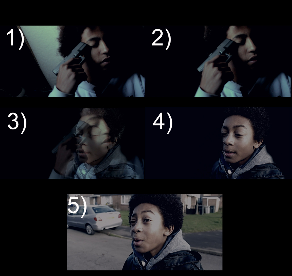
The Promise DVD cover

As Matt was having a artist block with the DVD cover for the film I decided to dust off my non-existent Photoshop ‘sKiLLz’ and have a go at creating one. I started off using Matt photo of Blake that he had already done as I thought that was really successful and then I dug out some other pictures of the characters in our film for the other two pictures. I then took them all and stuck them all together in a sort of montage of pictures to create the effect you see.
I’m quite happy with the way it turned out, before attempting it I had a look at some examples from similar genres to us such as Kidulthood and Ill Manors.


I really liked how the title of the film was placed and was a big focus in the box for Kidulthood. I also liked how both films showed a lot of the character/s on the box cover so I decided to incorporate both of those things in my design. I made sure to study both covers to see what was included on them here is the list of what I jotted down.
- Title of the film
- Picture of character/s in the film
- Tag line e.g ‘We are all products of our environment’
- Directors name
- Reviews
- Age Rating
I made sure to include all of these apart from the director (for the sake of group politics),reviews as unfortunately we didn’t have any from creditable sources, and a age rating as we didn’t have one of those yet either, haha!
All in all quite a successful little attempt at Photoshop!
-Jay
$
The Music Of Our Film

As I have stated before we wanted grime/hip hop music for our film. We have stuck to that as it gave the correct urban and gritty feel we wanted while still being ‘film type’ music. It was crucial we got the right piece of music as it is crucial that it can manipulate the audience to give the feel we are looking for.
The first track is for the titles and to underlay the narration, I believe with the music it adds tension and weight to them, through its harsh beat and distorted melody. It was just what we were looking for, check it out here!
And here is the second track which is for the 3rd scene and it needed to be intense while creating a horror element to the piece rather than using music to glorify the action like a Tarantino type action scene would. So we picked a music that had the correct combination of crazy/intensity and at the same time would make the scene more horrifying to watch, I think it works really well!
– Jay
$
Requiem for a Dream
As the year draws the a close, Its made me look back on some of the films I’ve viewed this year and how they have inspired me. And one of film just kept coming up in my mind, Requiem for a Dream. Not only are the actors performances flawless, the camera work, editing and cinematography are some of the most original work I’ve seen in film. The editing and camera work particularly inspired my project that I am working on.
Here is a montage I found on Youtube of some of the really original sequences used in the film to put a focus on certain actions or characters
The sequences mostly include black backgrounds and this really inspired me as a film maker to do something similar for a transition in the opening as it really puts the focus completely on the object or character. I used it to put the main focus on what would be the main character in the film, so the audience would know right off the bat who they should be focusing on.
Here it is, the transition of our main character from the old version of him to the younger. I feel it is very successful and adds a original flare to the transition. So thank you Darren Aronofsky!
Requiem for a Dream also inspired our first shot as you can see here:


The box art to Requiem is very powerful and was something I wanted to use in our film as a shot, the character slumped up against something in a shabby location instantly makes us wonder – how they got there? Why they are there? Where are they? And just as the cover would make you want to watch Requiem, I want the opening shot of my project to make you want to continue watching!
-Jay
$
Pacing – Scene 3
‘Pace can all too often be an under-valued tool in the world of film making with the speed at which a narrative unravels regularly a deciding factor in a films success. The pacing of a film can often tell the audience a lot about a director and the way they not only work, but also view the world.’
-Meek’s Cutoff (directorsnotes.com)
As Meek suggests pacing is very important part of a film that is often over looked. I have found that although some of the pacing is achieved on the shoot by filming each shot for slightly over the amount of time you want and the type of shots you choose, the majority of it comes in editing. And that’s where I come in! By cutting clips at different times you can achieve totally different effects, for scene 3 I wanted the pacing at the start to be slowish as it matched with the lack of non-digetic music and builds up some suspense and tension as it makes them concentrate on what RJ is about to do. As he enters the garage I wanted the pacing to slightly speed up as the tension increased but not so much that it seemed unnaturally and Hollywood when we are trying to remain in the social realism genre. All in all I’m pretty happy with the results! Here is the rough version of what I’ve done so far:
– Jay
$
Filming Opportunities!!!
FINALLY FILMING PAYS! Last Sunday Matthew and I were asked to film four music videos for my Dads band. He needed them as promo videos to show any potential clients so it was vital we did a good job! We only had about 4 hours to film 4 professional looking videos so the pressure was on! But we did get to record the video in a music studio where the likes of Kasabian, The Automatic and The Darkness had all recorded so it was a pretty cool experience! The four songs we did music videos for were Valerie, Hot and Cold, Moondance, and Sweet Home Alabama so quite a variety of songs to cover!
Before the shoot I’d prepared some notes for each video so things would move smoothly – such as the type of shots we’d use, the mood and style of each song and any solos in the songs that we’d need to be ready to switch the focus to them when it started.
The shoot proved to be a valuable experience as we got to work with lighting and we discovered lighting can change the mood of a set completely. For Moondance we set up the lights to shine a very blue colour this gave it a night and chill vibe that fits the song. We also used smooth shots using the glidecam and I faded them into each other to maintain the smooth, swaying mood. The video for it is below which I edited!
Whereas Sweet Home Alabama we used red lighting to give a warm southern rock feel we switched up the camera work so it was abit more handheld and rocky. I made the pacing in editing a lot faster for this one to give it excitement and energy.
For Valerie and Hot n Cold we set up the lighting so it put the main focus on the female singer in a spot light kind of way, and again used handheld shaky shots to liven up the video and make it exciting particularly for Hot n Cold Again with the editing I did faster cuts to again give it that rock/pop video feel that the band wanted to demonstrate to their clients.
This experience has taught me a lot; it improved my directing skills as I had to make sure the band was positioned right so we could get good shots of them. It also has aided my camera and editing skills as its given me some more practice with the equipment and it showed me how to successfully light a set to give a specific mood or theme which I can apply to our own project which I can apply when we film scene 2 of our opening or through altering the lighting and colors in editing for the other clips. Additionally it put me a situation of pressure where I had to get the shots efficiently as we had limited time in our location so we couldn’t be scuffing up any shots and doing many retakes. And finally it aided my bank account as I got payed for doing it! WOOP WOOP!
Here are some photos of the day!
-

- Setting up!
-
- Checking out the decks!
-

- Wooooooo
-

- Set up!
-

- First run!
-

- Wooopp!
-

- Directing! :L
-

- We in the studiioooooo!
-Jay
$
Film openings #4
Here are some notes I made on a couple of film opening, focusing on 5 key areas titles, camera, mis-en-scene, editing and sound. By looking at these I can see how a succesful film opening is put together bit by bit and see if I could apply and of the style to my film opening.
Lemony Snickett’s A Series of Unfortunate Events:

Titles – just the director fades in and out very small, then moves to waves that pop up showing other cretdits all animated in a sort of cardboard style, then moves to them flying throuh the air on a hot air balloon with credits appearing on fancy stars , then to a grave yard and other locations/patterns showing more credits in the sky fading in and out – interesting and querky sets he style of the film from the off making the opening captavating and keeping the viewer hooked. Animation surgest its for children but could also work for adults
Camera – Pans and tracks to follow the characters as they move through the locations
Mis-en-scene – animated, fantasy exadurated world enviroment, very dark, victorian era, muted colours heavy use of blacks – lots of use of eyes, salvador dali art style/gothic style
Editing – Animated editing, puppet style characters
Sound – non-digectic soundtrack, asian folky type music – surgest travelling and exotic
I’m really inspired by the fact that the director has set the scene through the use of music and mis-en-scene very clearly in the original way by using animation. The music and mis-en-scene are big parts of my film opening too, and is something I will work on to give the gritty/urban feel I’m after.
Cabin in the Woods:

Camera work – Mainly a two shot of the two characters engaging in a conversation
Titles – Blood / old pictures and a few titles then quickly cuts to a normal office scene then cuts to cheesy 70′s B-Movie title.
Editing – fast and sharp cut from titles to office scene, then continues with a more natural style of cuts, until it sharply cuts revealing the titles
Mis-en-scene – two everyday enviroments office and teenagers room – makes the audience feel at ease.
Sound – intense music then cuts sharply to office sounds and the dialogue of two characters, then a loud sound is heard when the title is displayed
There is not much I can take away from this opening as I do not find the title sequence very good it simply is another Hollywood fail of a Horror film, haha! But I suppose the loud and dramatic music is something I could use to draw people into the film.

Titles – Old camera style, pictures and basic motion shown pretty sketchy – this gives the impression of a home video, shows pictures and video of dead or dieing girls but there clearly being faked and set up by people as their hobbie – the pictures are acompnied by credits which fade in and out getting they also very slightly move. – Interests the audience as it is a unusual scene
Mis-en-scene – modern day, teenage girls,
Sound – Music is ‘documentarish’ suggesting it is a horror. And makes the opening have a kind of intense feel. – scews our view of the film making it seem more of a horror than it is
Camerawork – hand held, clearly amateur footage, makes it seem real.
Editing, fast paced – makes it exciting and interesting
I feel Ginger snaps is very interesting, the amateur feel to the footage is intriguing as it is not often seen in professional films, and leading us to believe something is happening which isn’t draws the viewer into the film and definitively inspired me to try and put that device into my film.
Overall the films showed me how they successfully developed the themes and style of their film in the opening or in Ginger Snaps case, disguise it. I shall try to make sure I have developed a theme, narrative and set the style of our film all in our opening. After reviewing our first shot, the script and storyboards I feel we are doing this.
-Jay
$
Low Light / Night Filming
For the third scene in our opening (the garage scene) we shall be filming it in the early evening resulting in us having to cope with some rather low light conditions. Of course we are trying to achieve certain effect by filming at night were not just doing it for the hell of it! Haha! As not only does night time reflect the typical time that robbery’s occur but also it fits into the time span and our scripting of the opening. Also at a more practical level it is the time when it would be easiest for us to use the location as it is closed.
So in preparation for this I did some research on how to film in low light conditions and came across a very good tutorial on YouTube, here it is!
Filming at night with the wrong settings can cause the footage to be too dark and noisy, leaving us with amateur looking footage. So as a further precautionary step I tried it out before our shoot, I applied the settings in the tutorial to my camera and tested away! Here are my results:
As you can see its turned out pretty well, it is a tad noisy in places but I know now now I can probably get away with 100 – 400 ISO and still have lighter enough footage to edit rather than having to shoot at 800 ISO. Also as far as our location goes as instructed in the tutorial there are a number of light source; the overhead lights of the garages island, passing cars headlights and the interior lights of the garage and showroom.
-Jay
$
This Is England ’86 – Ep 3 – ‘How does the director manipulate the audience?’

Here is the man I shall be analyzing today – Shane Meadows
(that sounded kinda creepy haha)
In the third episode of This Is England ’86 the audience is manipulated heavly by the director, Shane Meadows. As one of the directors in my group it is important that I pay particular attention to what Mr Meadows is doing so I to can manipulate my audience in our film opening.
Meadows kicks off the episode with a number of lighthearted events such as Gadgets humorous relationship with the Trudy. Trudy’s ‘cougarous’ (yes I made that word up) qualities are very strange but funny for the audience as a older women having a sexual relationship with a younger guy is not often depicted in popular media and so it is quite a shocking but humorous site to see. Also the fight with the truly hilarious moped gang is purposely showed in a comical way with people falling over in funny ways and up beat music as the soundtrack. This indicates it isn’t a no one is seriously hurt and that it isn’t a serious fight but more as a form of entertainment for both parties, again increasing the hilarity for the audience.

Gadget & Trudy ❤
These events all lure the audience into a false sense of security so that when the shocking rape scene happens towards the end of the episode it comes as even more of a surprise to the audience as it takes them off guard. There is little build up to it which reflects the way the girl had little warning for what Mick was about to do to her and also adds to the surprise factor. Although it is a awful and harrowing situation that Shane Meadows presents to the viewer it is one that makes the audience sit in awe of what the director has managed to achieve throughout the episode and shows how well crafted the show is. The crafting is something I’d want to achieve in my film opening in order to create the shocking atmosphere in our third scene, the garage shooting.

An interesting note to finish – the scene was clearly successful as many viewers called/twitted in to express there shock, check it:
> http://www.metro.co.uk/tv/841703-this-is-england-86-viewers-left-stunned-by-sick-rape-scene
Albeit the press put a negative spin on it but it does shows that Meadows put the viewer in such a real environment that they were effected deeply by it. Isn’t that something every director wants to achieve? It is definitely something I want to achieve in our social realism opening and so much can be taken from Shane Meadows.
-Jay
$
The Humble Ident
As one of my roles in group is editor, it is my responsibility to create a ident for our production company (Manual Matic Media). It is very important that the ident looks both ‘eye-catchy’ and professional as this is the first thing the audience will see at the beginning of the film. I want the audience to feel this is a professional-grade production right from the start so it is important to get this ident just right!
Research – Before jumping in and creating the ident I decided to do some research to see how the pros do it! First of I looked at the Miramax ident as that is the production company my favourite director Quintin Tarantino often collaborates with.
I really like how the ‘M’ moves across the screen revealing the other letters that is something I’d like to incorporate into my design. I also like how the light flashes at the end really highlighting the title. I’m not to keen on the music or lettering as that doesn’t fit our style, something less clean cut and grungy would reflect the genre we work inside (which of course is British Social Realism).
As Jay-Z says ‘on to the next one’
The classic Lucasfilm Ltd ident, I love the deep note noise and is something I’d like to do in my own way on my ident. I also like the use of lights to again highlight/uncover the title. The simple black background makes it stand out and is very effective. All in all a very good ident.
Planning – I quickly sketched a couple of designs on paper, then the one I liked I sketched in a bit more detail.
Editing – For my Ident I used a black background to make it stand out as I previously mentioned, I used a film burn behind the text at the start to slowly uncover it and a deep/harsh noise to set the tone of the film from the beginning. I made the ‘M’ move across the screen like in the Mirmax ident that I liked and had the rest of the title uncovered/highlighted by a burst of light like both the idents. I really think its turned out nicely, simple but effective.
-Jay
$
This Is England ’86 – First Impressions

This Is England ’86 is a 2010 A spin-off TV series from the 2006 film ‘This is England’. It focuses on the mod revival rather than the skin head culture of the original film. My first impression were very good, it kept the similar style of the film as it was directed by Shane Meadows who also did the original. As it was a series of TV shows it offered a slow paced look into their lives which also gave a deeper and more real view of all the characters (compared the film) while maintaining my interest with their constant believable life struggles that are displayed in the show for example Shaun quiting school and ‘trying’ to find a job. Simple life struggles of every day life is something I’d want to incorporate into our film opening as it adds to the realism of the piece which is a genre feature.
Overall my first impressions were very good and I enjoyed seeing how all the characters were doing years after the film. The was Shane Meadows and his team can capture a era so well is amazing to watch itself but what really makes it are the almost documentary type look at the lives of the youth in ’86. I’d give it a 4/5 only loosing 1 mark due to the constant sex scenes haha!
Although it is a TV show it does show how to achieve great dialogue and feel to a production that I can take forward and try to apply to my film opening.
-Jay
$
